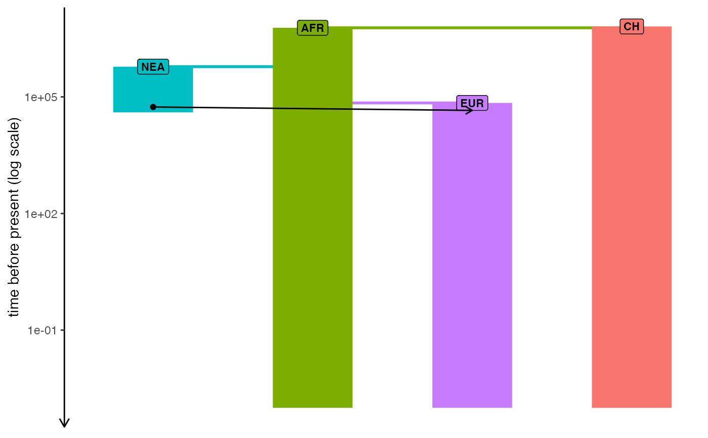
Plot demographic history encoded in a slendr model
Usage
plot_model(
  model,
  sizes = TRUE,
  proportions = FALSE,
  gene_flow = TRUE,
  log = FALSE,
  order = NULL,
  file = NULL,
  samples = NULL,
  ...
)
Arguments
- model
Compiled
slendr_modelmodel object- sizes
Should population size changes be visualized?
- proportions
Should gene flow proportions be visualized (
FALSEby default to prevent cluttering and overplotting)- gene_flow
Should gene-flow arrows be visualized (default
TRUE).- log
Should the y-axis be plotted on a log scale? Useful for models over very long time-scales.
- order
Order of the populations along the x-axis, given as a character vector of population names. If
NULL(the default), the default plotting algorithm will be used, ordering populations from the most ancestral to the most recent using an in-order tree traversal.- file
Output file for a figure saved via
ggsave- samples
Sampling schedule to be visualized over the model
- ...
Optional argument which will be passed to
ggsave
Examples
check_dependencies(python = TRUE, quit = TRUE) # dependencies must be present

init_env()
#> The interface to all required Python modules has been activated.

# load an example model with an already simulated tree sequence
path <- system.file("extdata/models/introgression", package = "slendr")
model <- read_model(path)

plot_model(model, sizes = FALSE, log = TRUE)